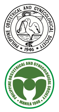
The POGS Logo
There is no record as to who was responsible for the design of the original logo of the Society. The logo with design the stork symbol and caduceus/rod of Aesculapius was on the cover of the souvenir program of the first annual scientific convention on July 6 -7, 1996. This showed a stork wading in a pond of water. In 1971, on the occasion of the silver anniversary two versions of the logo appeared on print. The souvenir program depicted the wading stork, but the proceedings showed a stork watching over a nest of chicks. In 1974, the cover of the souvenir program displayed a stork wading in water and its beak holding a bundle with a baby, apparently a reference to the myth of babies being brought by the stork.
According to the dictionary, a logo is a graphic representation or symbol of the company name, trademark, abbreviation, etc., often uniquely designed for ready recognition. This must have been in the minds of the LOGO Contest Committee which lamented in 1977 that “there has been a growing feeling in many sectors of the POGS that its official seal no longer depicts the true spirit of the Society or the philosophy and scope of the practice of the specialty”.
The original logo with the symbol of the stork was intended to represent the specialty of obstetrics. However, the idea of the stork as the mythical deliverer of a new baby is based on fairy tale, and will not be acceptable to the present generation of parents who surf the Internet and cyberspace. The rendering of the stork figure in various poses and guises did not help either in establishing a visual identity for our society. Thus was realized the need for change.
In or search for an emblem, we wanted a symbol to replace the old figure of a stork which had a negative connotation, like failure, weakness or even extinction. In fact, the move to change the logo was triggered by the casual comment of one of the speakers during the 1976 annual convention who thought of the bird figure as reminiscent of the dodo, an extinct species.
In accordance with the tenet of painter E.R. Tagle in Positivism on Art, the emblem to represent our Society should stress the positive, and what better way to depict this than with the circle in the center of the design. This is the focal point or accent that gives the design visual impact. The circle is a symbol of perfection.
In our logo the circle within the stylized uterus represents the product of conception, begotten of the Creator’s perfect will. As obstetricians we are reminded of our goal to deliver a perfect product, born free of any defect or handicap, born with its genetic endowment undamaged and intact.
The new logo imparts a visual identity to our Society and projects to our clientele what we are and what we intend to achieve. The POGS is a Society that has a social responsibility and a social conscience, involved and concerned with the basic problems of human existence, and committed to excellence.
The new logo was presented to the Society in the annual convention in November 24-26, 1978, and has been our emblem ever since.
Reference: ABAD R.S.: The Birth of a logo. Phil. Journal OB-GYNE, 3:11-12, 1979
ABAD R.S. The POGS Logo. POGS at 50 Ever Onward ro Excellence, page 50,1996


